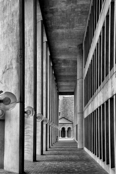
The photo below is of The First Church of Christ, Scientist in Boston, MA. It’s actually a portion of the outside of the church. I got lucky and for a few minutes there weren’t any people wandering in and out of the columns and plaza. I’ve wanted to photograph repeating columns for a while now, but haven’t been able to find a suitable subject. I was at this site a few months ago and thought that this time the lighting might be better. Well, it was raining, but at least it was daylight… I didn’t have my tripod with me but I was able to use a steady stance (feet spread, elbows tucked in, hand supporting lens, etc) and used the following settings: ISO 250, f/16, 1/64 sec, 70mm, no flash. The photo was a little flat because of the neutral grey color of the columns and ceiling. The rest of the stone work was relatively low contrast (grey and light-colored brickwork). The only mildly eye grabbing color was the roof on the smaller church building – a pale green color. So…
I opened it up in Photoshop Elements 10, used the Transform option to fix the slight perspective distortion of the columns, cropped out the closer distracting column, then decided to convert it to black and white using Silver Efex Pro 2. The conversion highlighted the different textures of the columns, roof, walkway, and smaller stone church building at the end. I applied a little sharpening at the end and called it a day.
I like the result. The variety of geometric shapes and textures appeals to me. What do you think? Can I do something to improve it? Leave me a comment and let me know!
